The idea
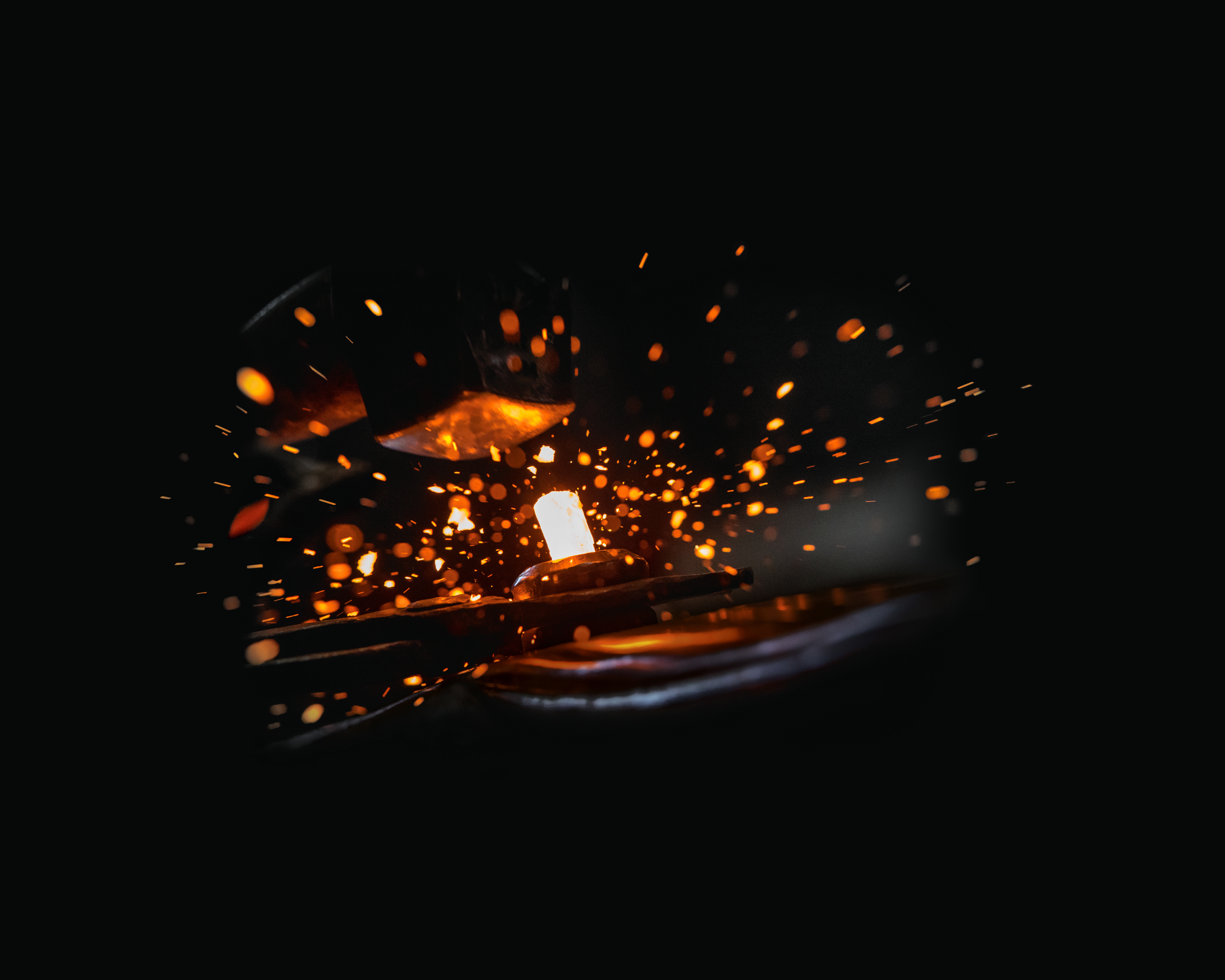
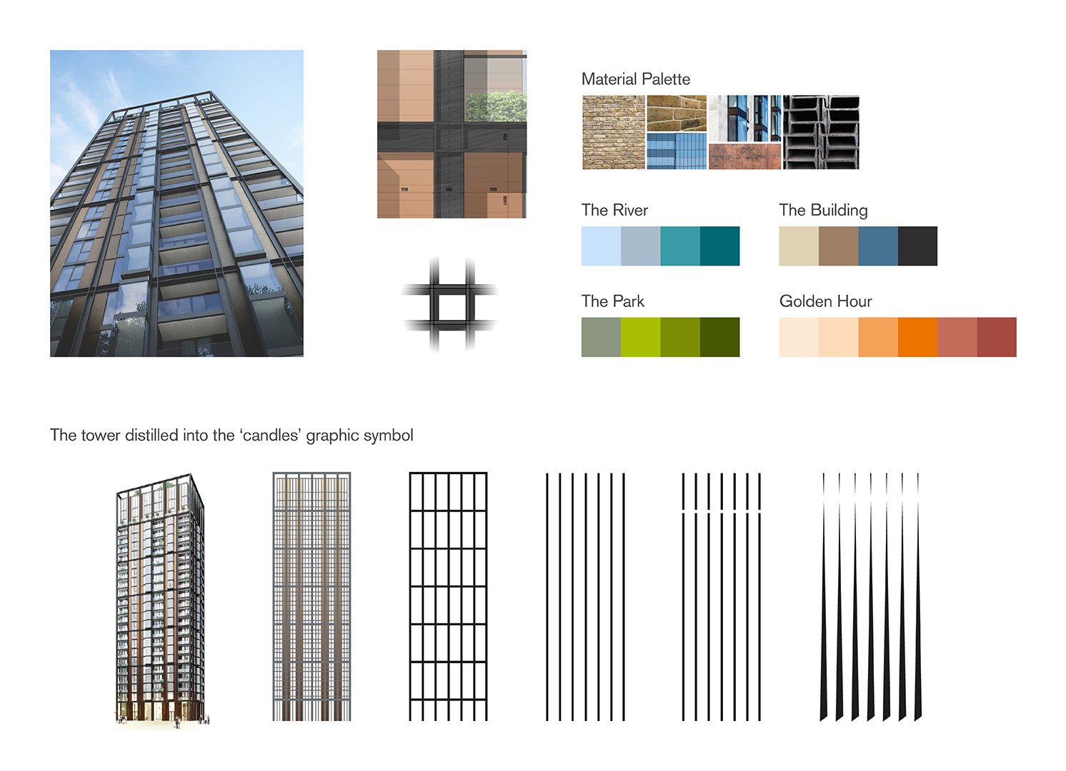
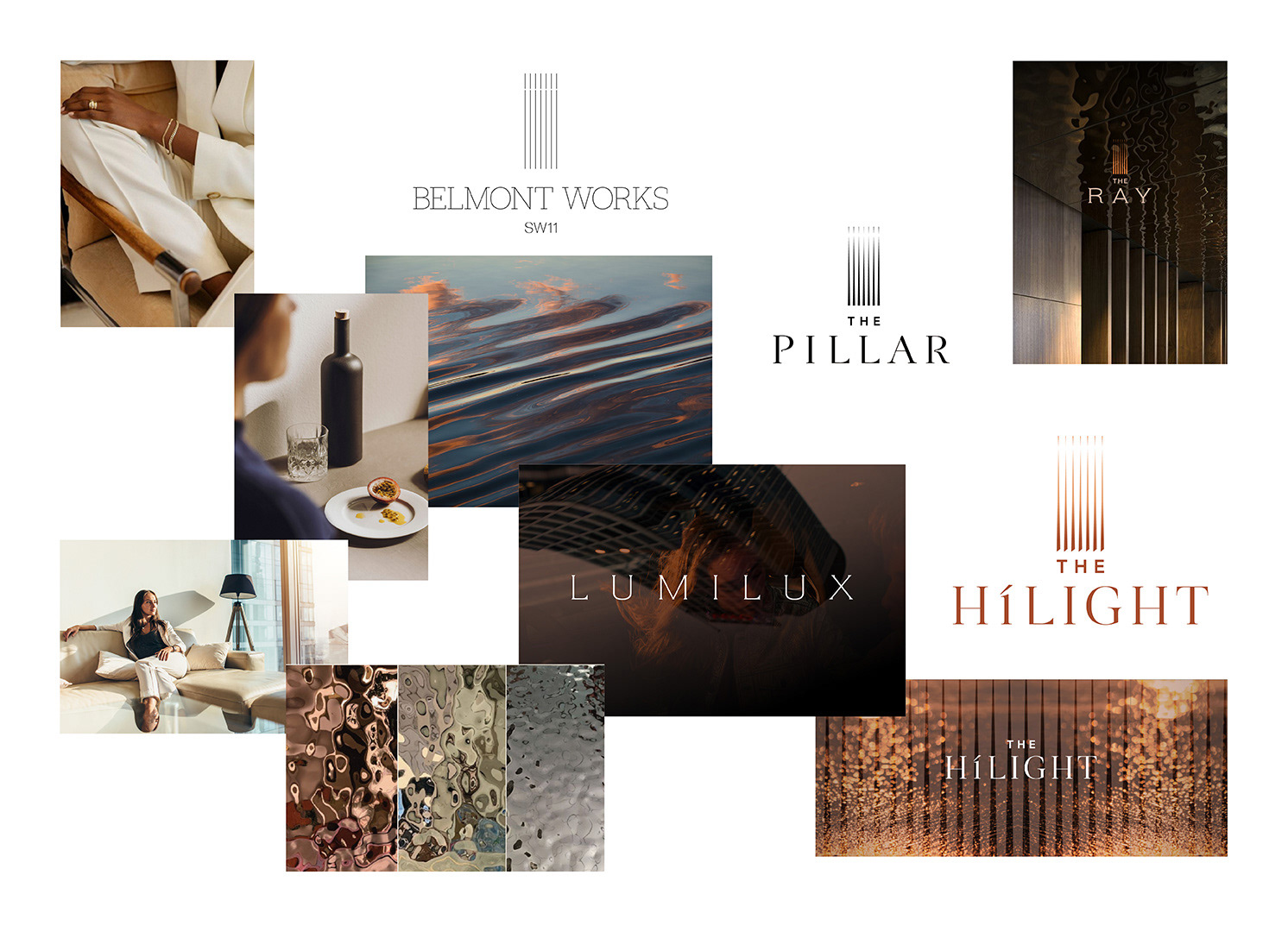
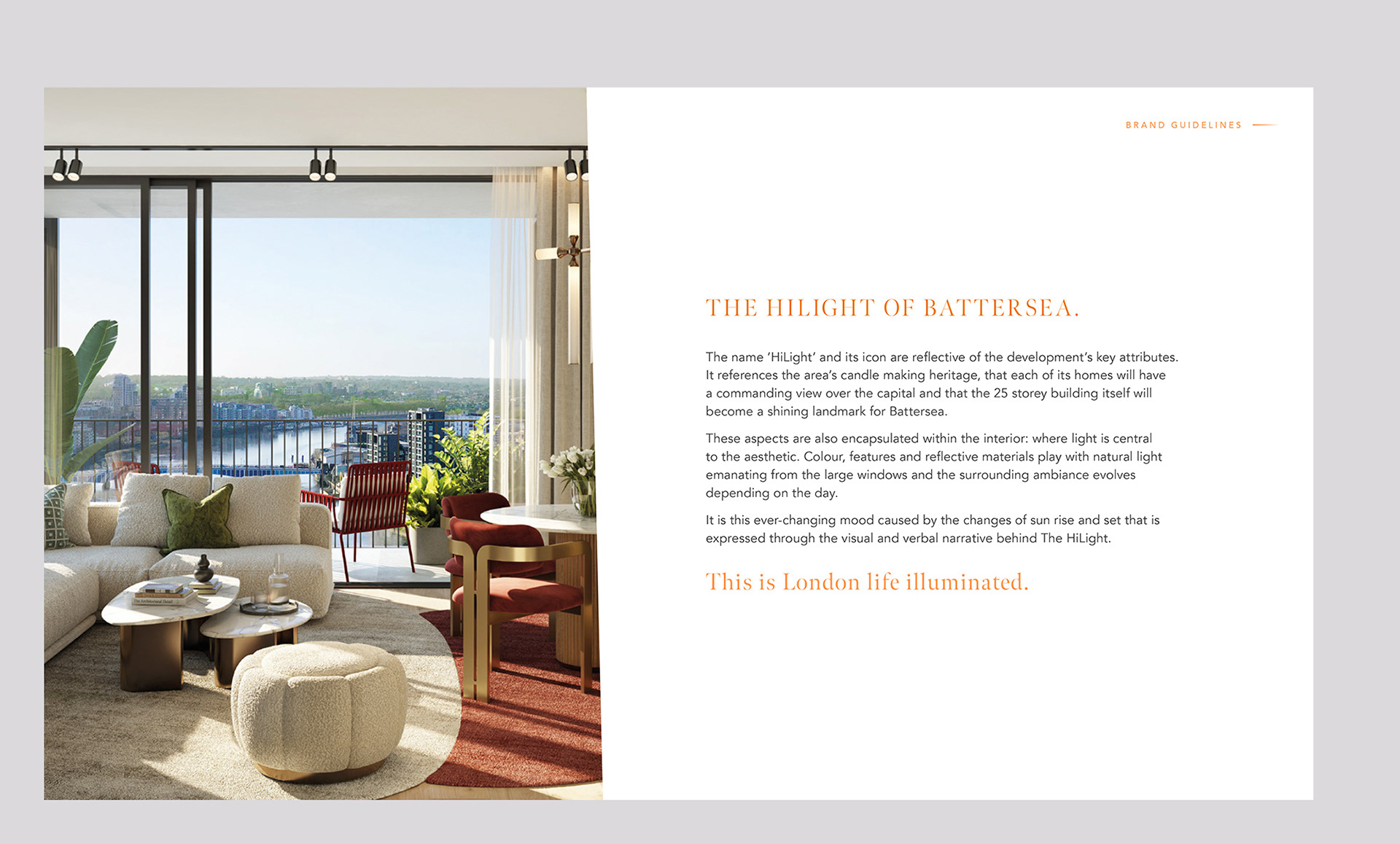
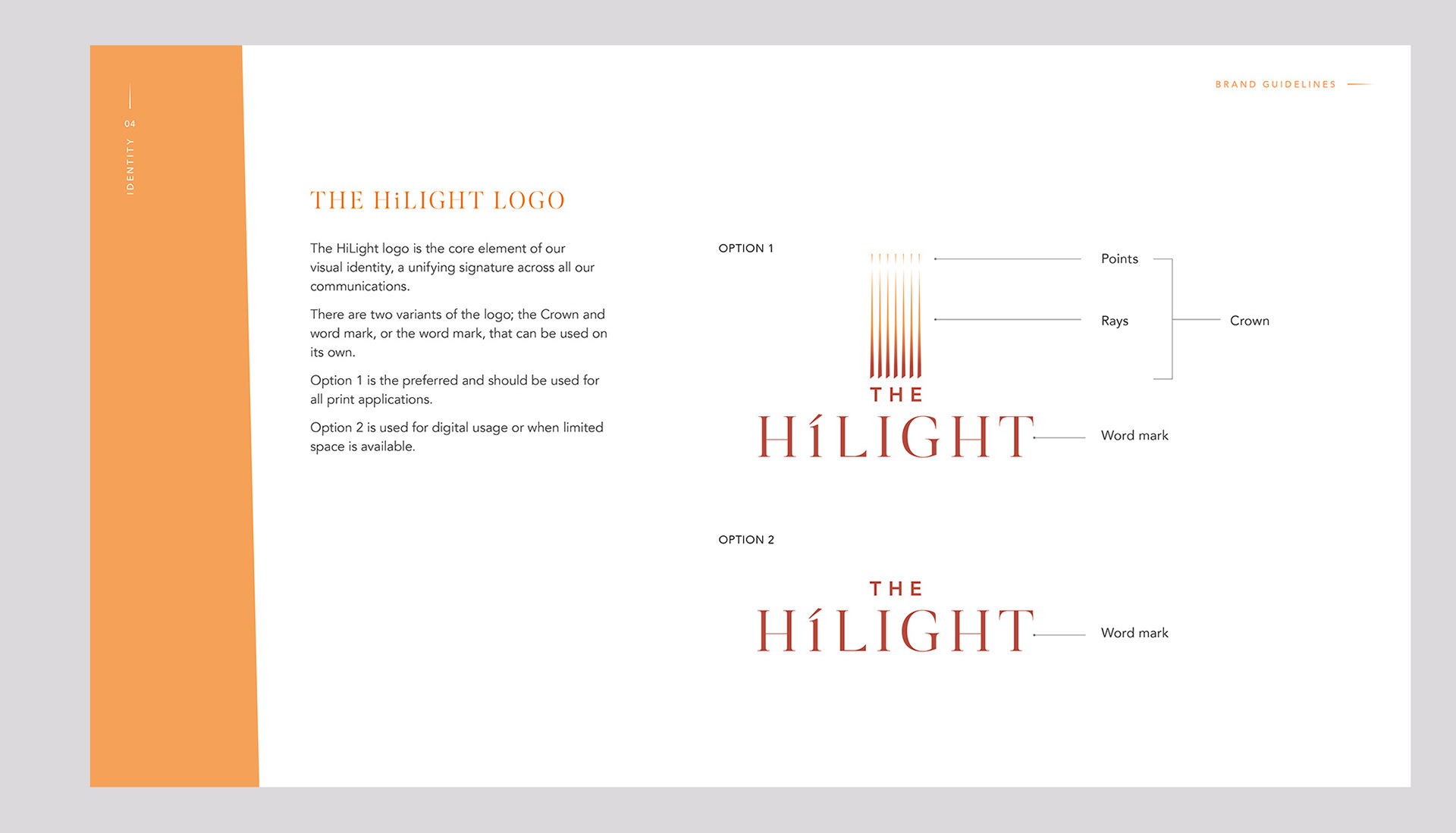
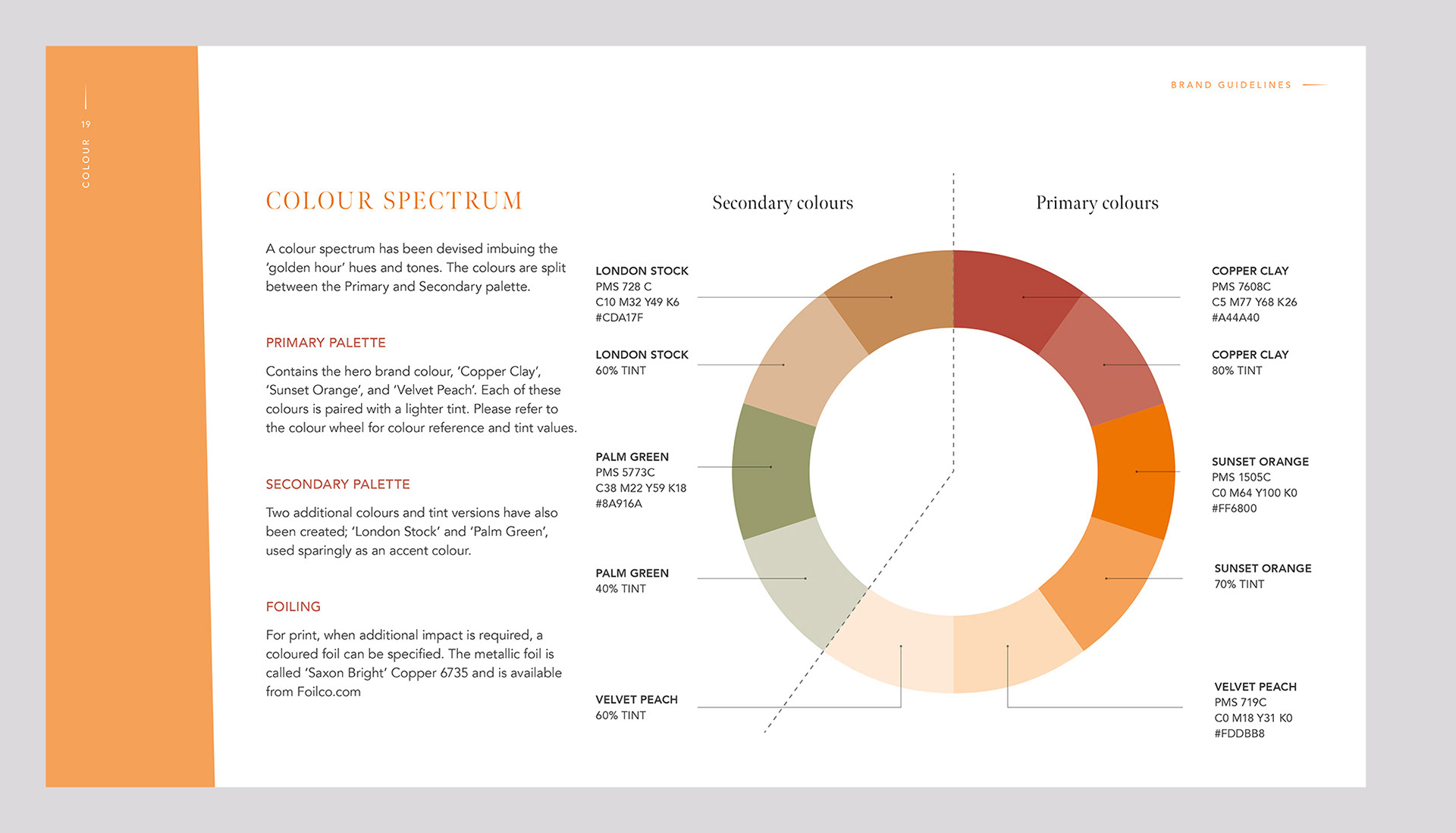
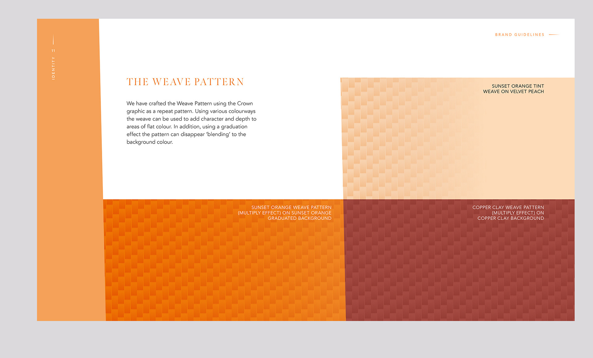
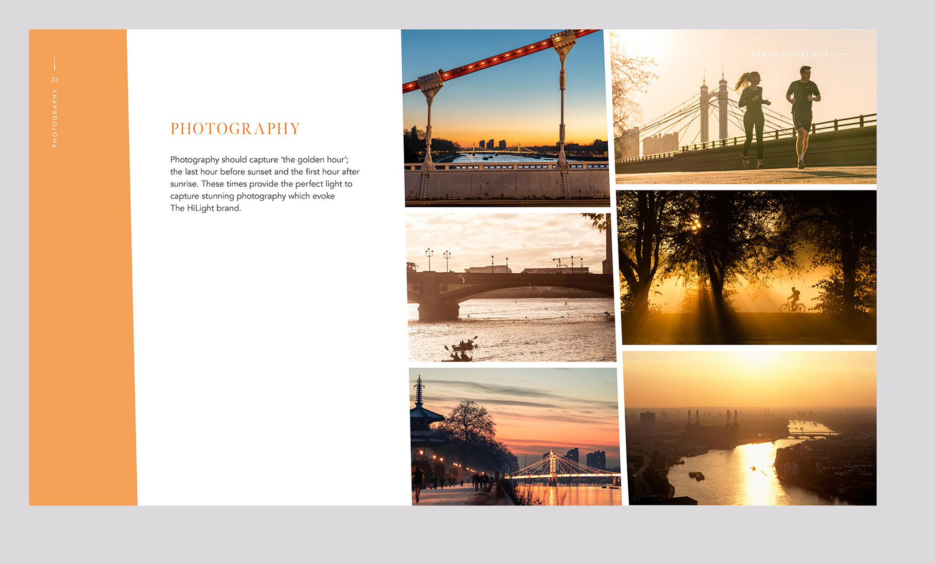
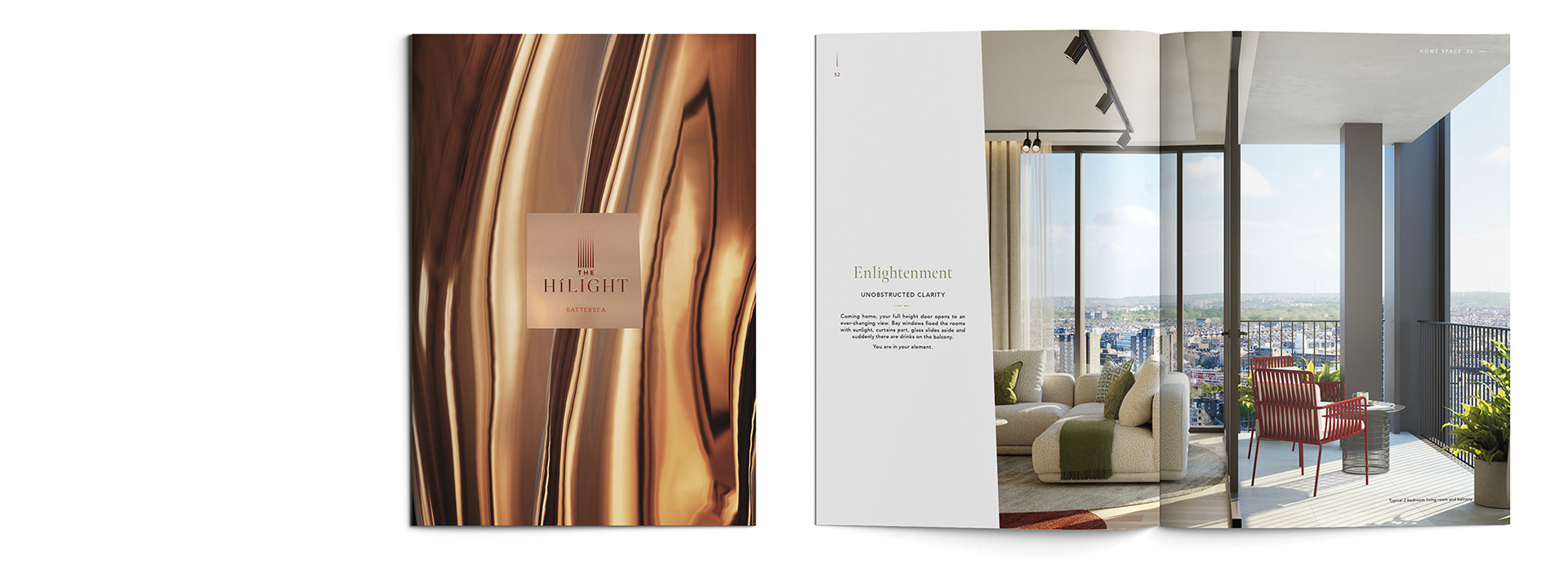
The branding process began with extensive name exploration, ultimately landing on ‘The HiLight’, a name that celebrates the site’s candle-making heritage while positioning the tower as a landmark. The identity combines a refined wordmark with a graphic symbol inspired by the building’s steel girder structure, and the ‘golden hour’ palette captures the ever-changing natural light central to the scheme’s aesthetic.
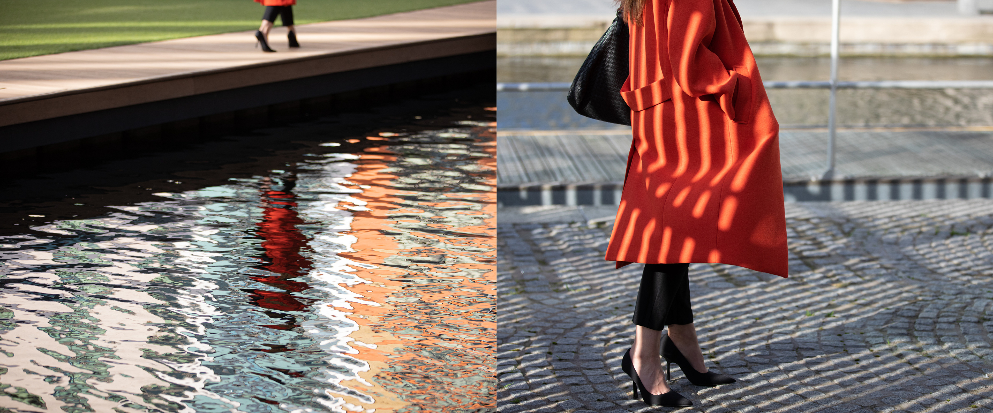
The HiLight website features immersive, full-width lifestyle imagery that seamlessly blends into a single background. The homepage showcases aspirational living through vertical scrolling, while horizontal scrolling offers a deeper dive into the scheme, residences, amenities, and location. Each of these topics has a dedicated webpage.
